Hi! I'm Zeno.(You probably figured that out already)
I make experiences that make me smile, and help people be their best selves.
👨🏼💻
Creativity and code
My passion is organising information in a visually striking way, and bringing complex ideas to life with technology. I am naturally curious for the world, and love exploring big ideas while collaborating across disciplines.
🛠
Invisible tools
I love the concept of digital tools: Interfaces that help you create, work, discover, and grow in any way you find important – without being in your way.
✨
Polish every pixel
Call me a devil, cause I'm up in those details. Interfaces are so much more than just static screens: they have loading states, page transitions, edge cases and more. My favourite thing is enriching interfaces with animations and interactivity.
This is a worthwhile read for anyone exhausted from the endless tail-chasing of personal brand-building and marketing themselves constantly across social media:
"The next time you use something that works so well you barely notice it, remember that somewhere, a designer solved a problem so thoroughly that both the problem and its solution became invisible. That designer might not be famous ... but they’ve achieved something remarkable: greatness through invisibility."
Got to write a piece about what I’ve been working on as a #DesignEngineer at GitBook over the last months: a revamp of the customisation/theming system! Including a bunch of technical rabbit holes I went down 🐰💻
Fixes truncated sections when the section group popover overflows
Improve the layout of sections to be more space-efficient
Break into multiple section columns per group later (5 → 8)
Before, after
Updated my #portfolio with a new, simpler Activity section. It aggregates blog posts and mastodon in one big carousel, with more sources to follow soon.
Tinkering with CSS grids and the #mastodon API made for a super fun holiday project! Really happy with how it turned out 😊
Standardise on a new <Input> component that takes care of submitting, clearing, and validating. Can be controlled or uncontrolled, multiline (renders as textarea) or single-line (renders as input).
Untitled.1.mp4
All existing inputs on the site have been reworked with all functionality intact and minimal style changes.
PageFeedbackForm has been updated more substantially, using the new styling.
1. Nice to see aria-labels even on stuff as extraneous as the store's hype queue. 2. Fascinating to see Apple do alt text in the same voice as its marketing.
My take on those trendy call-to-action buttons. You know the ones. So shiny. Big vibes. All CSS.
There are a few interesting parts to it, especially with the use of registered custom properties for smooth gradient rotations and hover transitions. Check out my latest post that gets into the details: https://ryanmulligan.dev/blog/css-property-new-style/
@LiftinApp Hey, my Ad-Hoc Routines carousel seems stuck, I’ve changed the routines inside that section but they’re not changing, even after I delete all of them I see the old routines there. Anything I can do?
The semantic text colors are more dull than the normal ones, which hampers their use somewhat. Let's make them more vibrant and add a contrast-check so we can fallback to readable text if the browser requests it.
Before, After
Update the embedded frame to support sites without assistant, by including two tabs: "Assistant" and "Docs". The right tabs will be loaded by default, but can be overridden with local configuration options.
Restyle the embed frame with a sidebar for tabs + custom actions
Add a trademark to the embed frame
Tweak some in-site components to display properly in the embed frame
Update the embed docs
Tests are added in separate PR: #3830
Removing AsideSectionHighlight in favour of CSS-only changes on the active link element itself prevents a repaint and reduces lag (especially on Safari).
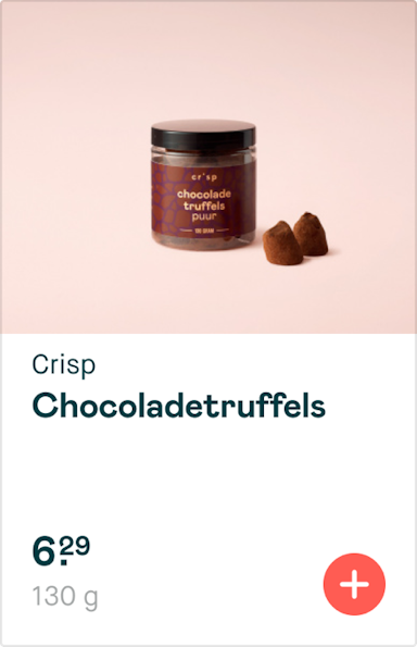
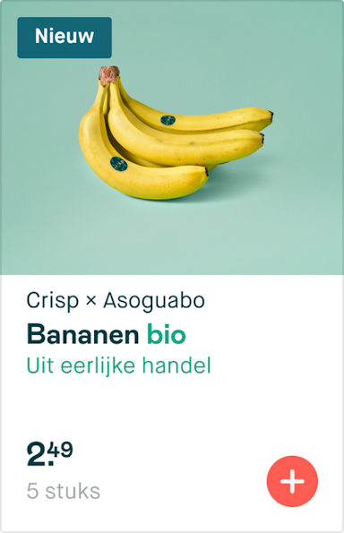
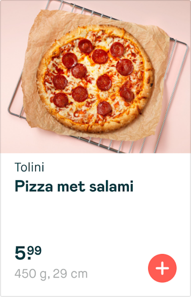
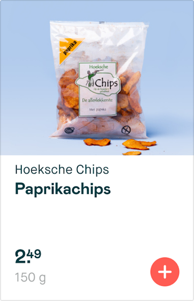
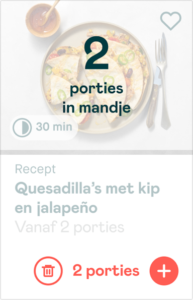
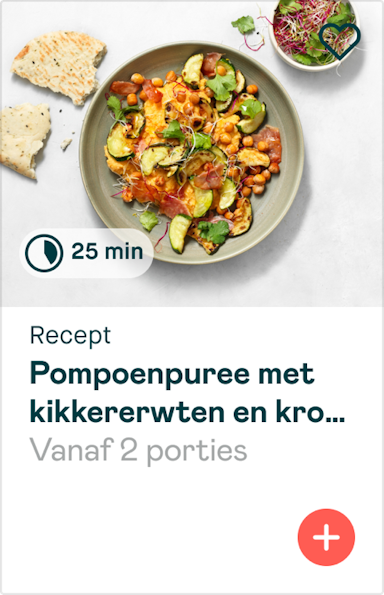
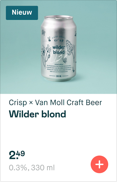
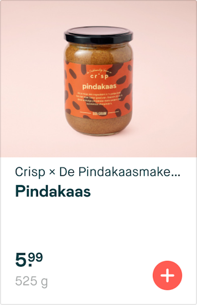
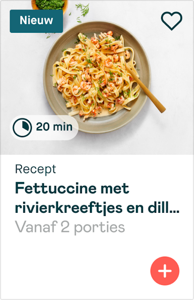
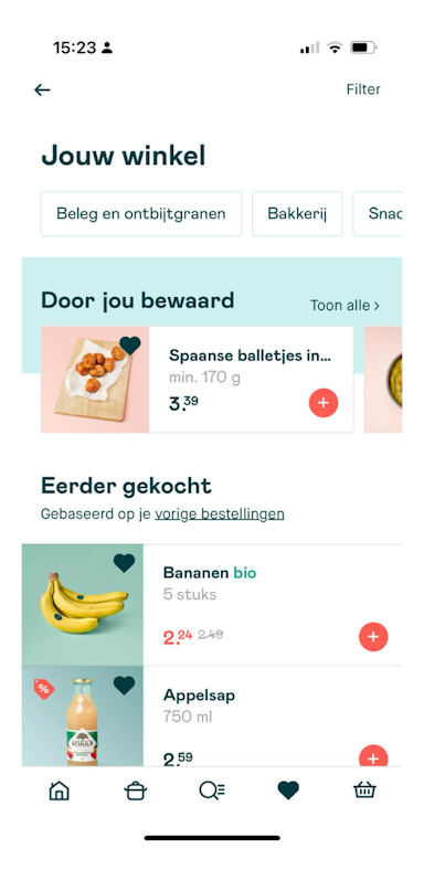
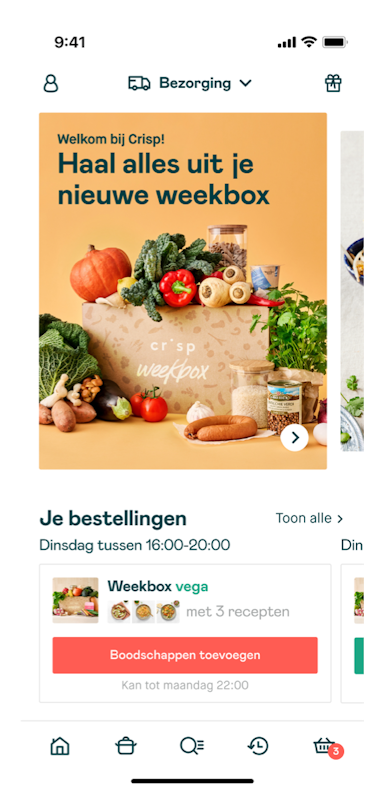
Crisp is a grocery store app for locally sourced fresh food. Its mission is to improve the food system by effortlessly bringing better food to more people.
As Product Designer I help make the app look good and work smoothly, with involvement in the entire product chain: conducting user research, feature discovery, designing iterations in Figma, speccing tickets for developers, testing implementation, building and releasing to users, and monitoring adoption by writing SQL and dashboards.
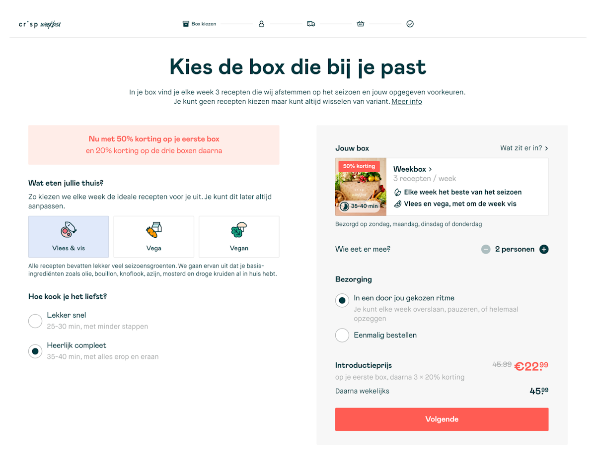
My biggest achievement is the newly-launched Weekbox, our take on mealkits and a whole new paradigm for Crisp. I have designed every flow, from onboarding to cancellation, helped tailor the core proposition, and helped steer the rollout to production.
Beyond that I have contributed dozens of new features to the app, helped solve hundreds of bugs, set up the design system from scratch, regularly shipped the app to alpha / beta / production, led internal team meetings, and presented inspiration sessions to the whole company.
Created with code!Riverside
As the first Design Engineer at online recording platform Riverside, I bridged the gap between the design and development teams by designing new features and creating prototypes, animations and code examples that would enhance the product further. I also set up and maintained the Riverside Design System.
The feature I'm most proud of is the Media Board, which lets you upload, preview, and record audio and video in your online studio. Small details such as the design of the Preview/Live toggle and the Grid View inspired by Launchpads were a delight to work on.
From the moment he joined, Zeno played an important role in shaping Riverside’s UI and UX. He brought structure to our new design team by independently conducting user research, collaborating across teams, and setting up an extensive component library in Figma. He thinks like a developer when he needs to, which has made implementation a breeze and made our product shine.
Carried out in the scope of the MA Digital Experience Design at Hyper Island UK, my graduation thesis examines flow in digital tools, and aims to provide a new model to help digital designers create interfaces that cause (more) flow.
This is a very valuable piece of work with a clear deep understanding of the issue in the area and a realistic, understandable model delivered in a very professional and academically robust manner.
The flow funnel is giving me and the team a better understanding and a handle to talk about the difference in skill/experience levels of our users. It was a revelation to see this mapped.
Dutch Coding Company is a web & app studio based in Eindhoven. I have had the pleasure of working with them on multiple projects, from mobile apps to animation-enriched websites. As part of their website redesign, I got to add animations and page transitions in numerous places.
To accompany the beautiful videos they made, I created a number of 3D device components that would spin- or flip around as you scrolled the page. In places where a handmade video couldn't be made, the device frame could be filled with a screen recording, and it would mirror the 3D transforms made by the device. Another highlight is the website's main menu, which includes staggered animations and a smoothly rippling wave at the bottom.
Zeno works end-user focussed, with a critical, introspective attitude and tremendous work ethic. However, the secret sauce is his attention for detail - the little animations and micro interactions - that elevates everything to a blissful experience.
In 2015 I was approached by a group of authors to collaborate on a special project: a website about the serious side of the Eurovision Song Contest.
Everything about Eurostory is custom-built with attention to detail: a specialised block editor, a rich database of contest info, SEO optimisations, and a sleek design.
To top it off, during the Song Contest itself I get to make short vlogs about my experiences, finding my way as a videographer.
Zeno is the perfect example of a multifaceted designer. He is perfectly able to translate our wishes into a well functioning, beautiful interface, but he also comes up with ideas we didn't know we wanted to incorporate – but we do. It's been a constant joy to work with him.
Edward van de Vendel, author
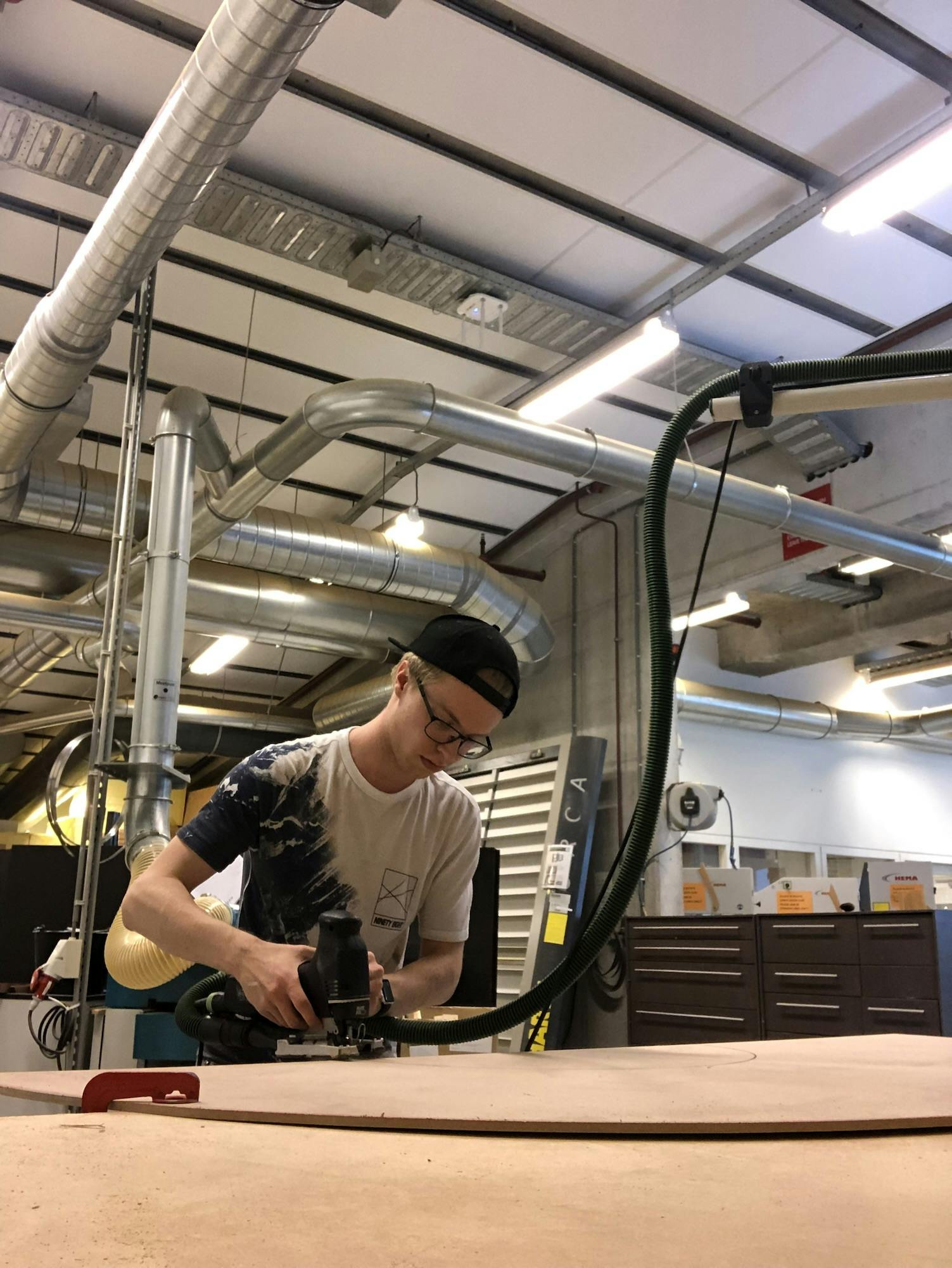
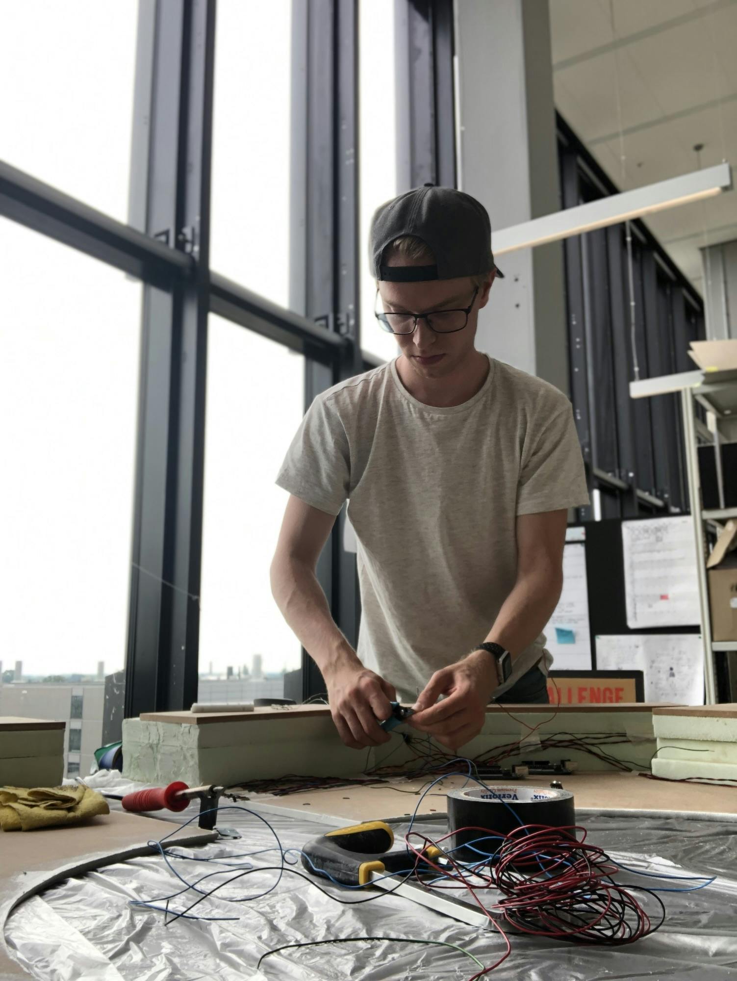
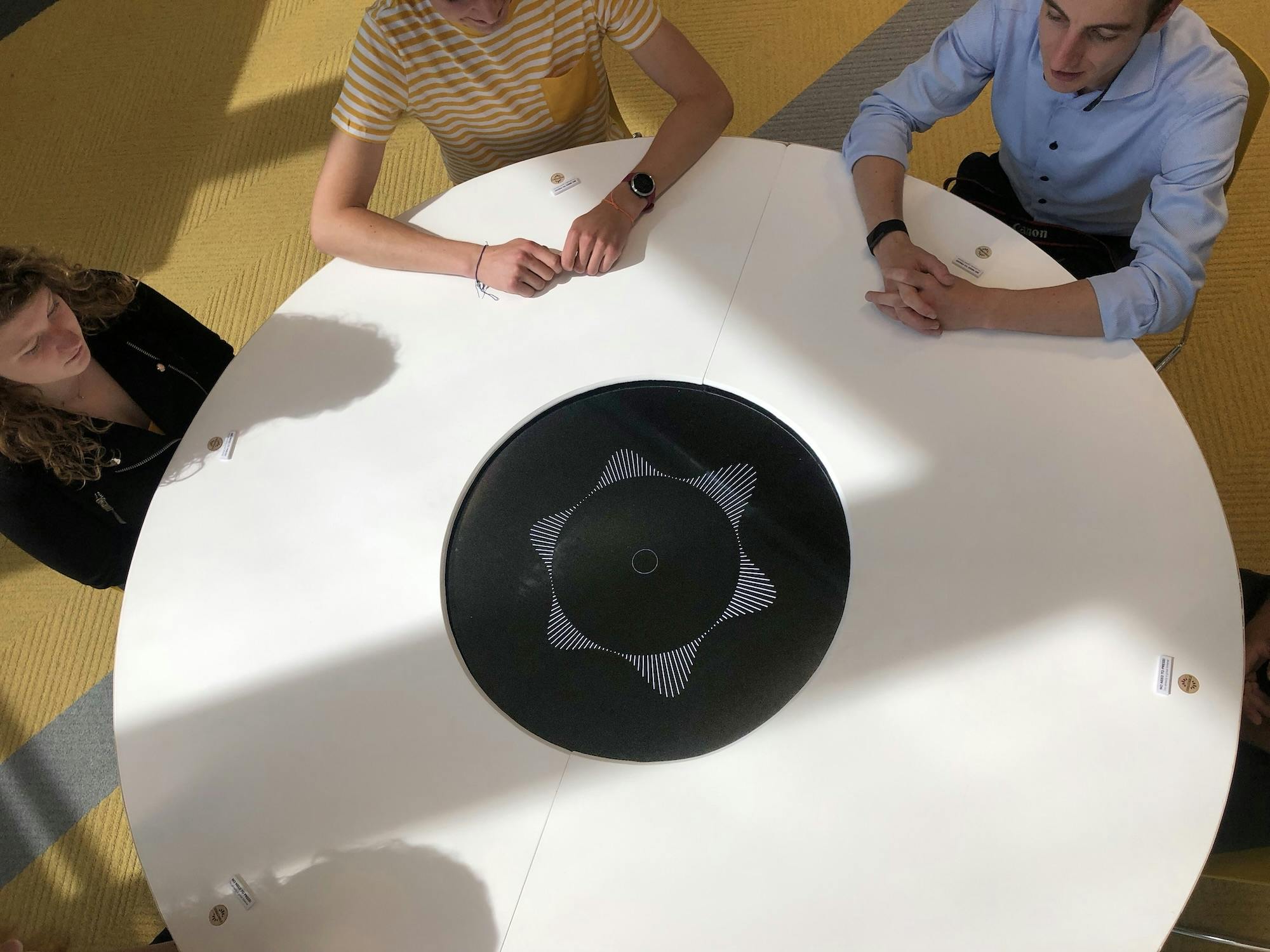
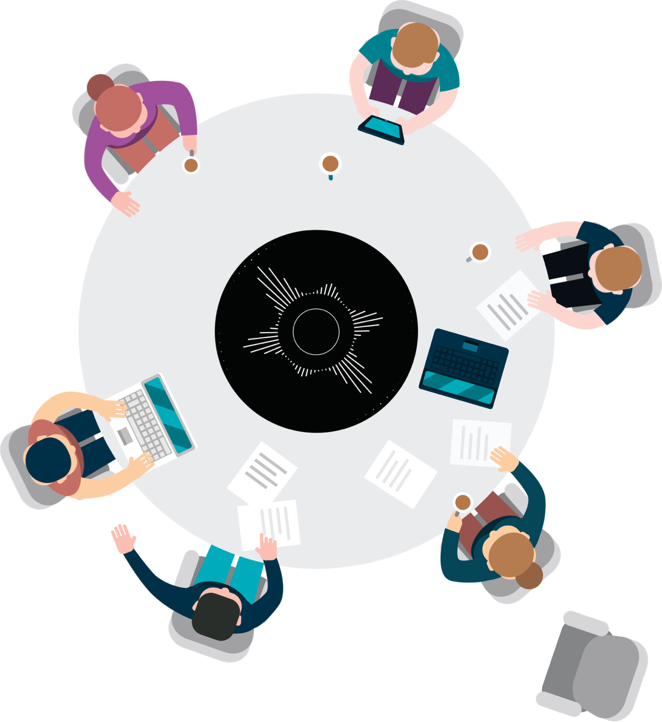
DebaTable
DebaTable is a technologically enhanced meeting table that mediates discussions and stimulates time-efficient debates.
It works by measuring and then visualising each participant’s speaking time within the past minutes. Additionally, a slowly expanding circle in the middle shows the discussion time left per topic, as voted on by each participant.
In his Final Bachelor Project, Zeno clearly demonstrated his time at the University shaped him into a skilled designer with an eye for detail and one who is never afraid to learn new things. I very much appreciated his 'making approach’ in this project and have always been impressed with his professional attitude and his reflective stance.
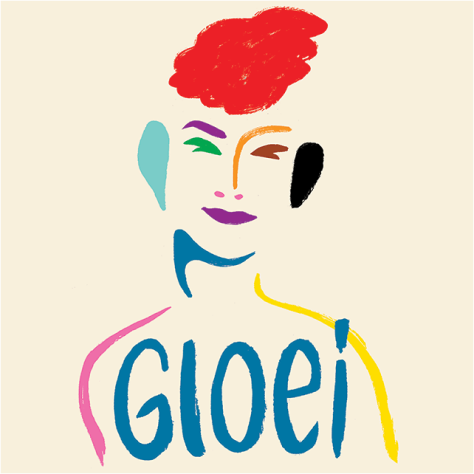
I had the honour of being interviewed by Edward van de Vendel in a book about LGBTQ+ youth called "Gloei". After a successful book launch, we started an interview podcast with the same name: "Gloei, the podcast".
Edward interviews a member of the LGBTQ+ community about their life. Afterwards, he reads a poem inspired by that person. Each episode is accompanied by custom art work. I was in charge of the audio and hosting.
Hackathons
Every now and then I partake in a 48 hour coding challenges, for example at Junction. Past challengers included Spotify and BlackRock – both of whom awarded our projects with a prize.
I have detailed the various projects over on my Blog.
Board Year
Wervingsdagen is responsible for organising the largest career events of the Eindhoven University of Technology, helping 160 companies with 3700 students. I learned to collaborate with my fellow board members, work with 9 study associations, and maintain professional attitude towards client companies.
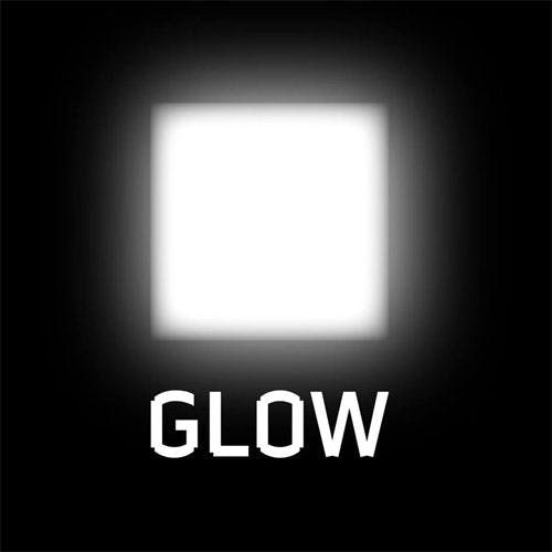
Light Art
Intermedia is an interactive light installation made for light art festival GLOW Eindhoven 2016. I programmed its 3 visualisations using a pretty complex technology stack (Kinect sensors, local networking, beamers, adaptive soundtrack). The result was a wonderful experience, with many strangers connecting with each other through a screen.
Get in touch
I'm @zenoachtig(It's funny in Dutch) pretty much everywhere.


